
App Drop-in UI Customization
Integrations guide
Colors
Set the colors in the UI:
Colors
You can define colors as follows:
| Property | Description | Light mode default | Dark mode default |
|---|---|---|---|
| Color palette | |||
primary | The color for illustrations and elements that require focus, e.g. buttons and inputs. This is the main color used in the app for e.g. animations, icons, primary button background, secondary button text, second option text primary button, scanner progress, table selectors, scanner checks, links. | # 0091FF | # 7FB3FC |
accent | The color for UI elements that offer clients a choice. | # 00E062 | # 00E062 |
dark | The very dark color palette, mainly used for the default heading color. | # 333333 | # FFFFFF |
darkLight | The mid-dark color palette, mainly used for the default text color. | # 585858 | # C3CDD8 |
darkLighter | The lightest-dark color palette, mainly used for the default alternative and less emphasis text color. | # 878787 | # 3D5671 |
darkSoft | The soft dark color palette. | # D6D6D6 | # 263444 |
light | The light color palette, mainly used for the default backgroundColor. | # FFFFFF | # 172637 |
gray | The grey color palette. | # B3B3B3 | # 607B93 |
| OrcaScreen | |||
backgroundColor | The default backgroundColor for the drop-in screen. | light | light |
headerColor | The color for the screen header. | dark | dark |
titleColor | The color for the screen title. | dark | dark |
messageColor | The color for the screen message. | darkLight | darkLight |
dividerColor | The color for the dividers. | darkLight | darkLight |
tableCells | The color inside table cells. See OrcaCell 1 & 2. | ||
| OrcaCell 1 | |||
cellStyle1 | The cell style for the document type screen document option. | ||
backgroundColor | The color for the background of cells. | white | # 263444 |
textColor | The color for text in cells. | # 333333 | white |
iconColor | The color for icons in cells. | primary | primary |
borderColor | The color for the borders of cells. | clear | clear |
dividerColor | The color for dividers between cells. | clear | clear |
| OrcaCell 2 | |||
cellStyle2 | The cell style for the documents to sign on the Document approval screen. | ||
backgroundColor | The color for the background of cells. | white | # 263444 |
textColor | The color for the text in cells. | primary | primary |
iconColor | The color for the icon of cells. | primary | primary |
borderColor | The color for the borders of cells. | black 10% | white 10% |
dividerColor | The color for dividers between cells. | black 10% | white 30% |
| OrcaCheckbox | |||
tintColor | The primary checkbox color. | primary | primary |
iconColor | The color for the checkmark icon. | light | light |
| Buttons | |||
primary.textColor | The primary button text color. | light | light |
primary.backgroundColor | The primary button background color. | primary | primary |
primary.borderColor | The primary button border color. | black 10% | black 10% |
secondary.textColor | The secondary button text color. | primary | primary |
secondary.backgroundColor | The secondary button background color. | backgroundColor | backgroundColor |
secondary.borderColor | The secondary button border color. | black 10% | black 10% |
backButtonColor | The Back button text color. | primary | primary |
scannerPrimary.textColor | The primary scanner button text color. | light | light |
scannerPrimary.backgroundColor | The primary scanner button background color. | primary | primary |
scannerPrimary.borderColor | The primary scanner button border color. | black 10% | black 10% |
scannerSecondary.textColor | The secondary scanner button text color used in the Scanner confirmation screen for the No button. | primary | white |
scannerSecondary.backgroundColor | The secondary scanner button background color used in the Scanner confirmation screen for the No button. | white | darkLighter |
scannerSecondary.borderColor | The secondary scanner button border color. | black 10% | black 10% |
linkButtonColor | The color for links. | primary | primary |
checkbox | The color for checboxes. See OrcaCheckbox. | ||
| OrcaInputField | |||
textColor | The color for input field text. | dark | dark |
disabledTextColor | The color for input field text in disabled state. | black 20% | white 20% |
placeholderColor | The color for input field placeholders. | dark 60% | dark 60% |
titleColor | The color for input field titles at the top and next to the field border. | darkLight | darkLight |
statusColor | The color for hint messages below input fields. | darkLighter | darkLighter |
errorColor | The color for error messages below input fields. | danger | danger |
backgroundColor | The background color for input fields. | backgroundColor | backgroundColor |
disabledBackgroundColor | The background color for input fields in disabled state. | dark 10% | white 40% |
borderColor | The unfocused border color for input fields. | gray | darkLighter |
disabledBorderColor | The color for input field borders in disabled state. | # B3B3B3 | darkLighter |
| OrcaScanner | |||
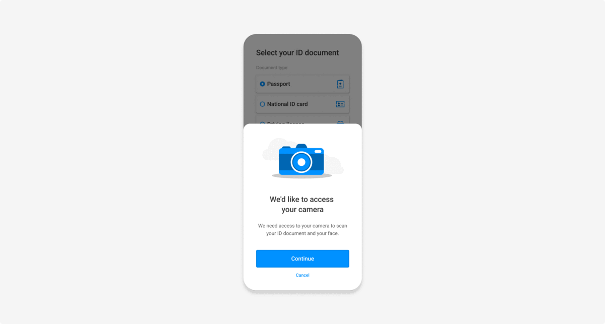
confirmation | The colors for elements on the Scanner confirmation screen. See OrcaScannerConfirmation. | ||
spinnerColor | The color for loading animations in selfie and liveness scanner screens. | primary | primary |
progressColor | The color for progress indicators in the document scanner screen. | primary | primary |
| OrcaScannerConfirmation | |||
textColor | The color for scanner confirmation text. | white | white |
backgroundColor | The background color for Scanner confirmation screens. | # 333333 | # 172230 |
bulletList | The color for bullet lists. | primary | primary |
| OrcaHint | |||
textColor | The color for hint text. | dark | dark |
backgroundColor | The color for hint backgrounds. | # F3F9FF | # 3E586F |
borderColor | The color for hint component borders. | black 10% | black 10% |
| OrcaBox | |||
backgroundColor | The default background color for boxes. | # F7F7F7 | # 121C28 |
borderColor | The border color for boxes. | black 10% | white 10% |
titleColor | The title color for boxes. | darkLight | darkLight |
| OrcaPopup | |||
backgroundColor | The background color for popups. | backgroundColor | |
titleColor | The title color for popups. | dark | |
messageColor | The color for messages in popups. | darkLight | |
| OrcaGraphic | |||
backgroundColor | The background color for introduction animations. | # F3F3F3 | white 10% |
primaryColor | The color for animations in introduction screens. | primary | primary |
Android & iOS examples
Example code:
import com.fourthline.orca.core.flavor.OrcaColors
import com.fourthline.orca.core.flavor.OrcaColors.OrcaColor
import com.fourthline.orca.core.flavor.OrcaFlavor

val customFlavor = OrcaFlavor(
    colorsDark = OrcaColors.defaultDarkColors().apply {
      buttons.primary.backgroundColor = OrcaColor.FromRes(R.color.colorPrimary)
      popup.backgroundColor = OrcaColor.FromInt(0xEEEEEE)
    }
)

// Usage
import com.fourthline.orca.Orca
import com.fourthline.orca.[product].[Product]CustomizationConfig
import com.fourthline.orca.[product].[product]

val customizationConfig = [Product]CustomizationConfig(flavor = customFlavor)

Orca.[product](context)
  ...
  .customize(config = customizationConfig)
  ...
var flavor = OrcaFlavor()

var colorPalette = OrcaPalette()
colorPalette.primary = .black

flavor.colors = OrcaColors(colorPalette: colorPalette)

// Update the colors of the primary button
flavor.colors.buttons.primary.backgroundColor = .yellow
flavor.colors.buttons.primary.textColor = .black
flavor.colors.buttons.primary.borderColor = .lightGray

// Update the colors of the popup
flavor.colors.popup.backgroundColor = .blue
flavor.colors.popup.titleColor = .white
flavor.colors.popup.messageColor = .white

// Add to the Orca Kyc builder
let configuration = KycConfig(supportedCountries: localDataSource.supportedCountries)
let customization = KycCustomizationConfig(flavor: flavor)
Orca.kyc
.configure(with: configuration)
.customize(with: customization)
.present { result in
   switch result {
   case .success(let kycInfo):
     print("Finished Orca with kyc info: \(kycInfo)")
   case let .failure(kycError):
     print("Finished Orca with error: \(kycError)")
 }
iOS dark mode support
iOS 13 supports dark mode. You can optimize colors for dark mode:
Either programmatically:
init(dynamicProvider: @escaping (UITraitCollection) -> UIColor)
Or using iOS Assets:
- Create a new color set from Assets.
- In the inspector panel, change Appearance to Dark mode.
- You can set 2 colors.
If initializing the drop-in with dynamic colors, dark mode is automatically supported.
Plugin examples
Example configuration JSON:
{
  "fonts": Orca Fonts Json,
  "colors": Orca Colors Json,
  "localization": Orca Localization Json,
  "layouts": Orca Layouts Json
}
- All colors are optional and if not set, the default is used.
- Specify colors in hex format.
- Start hex strings with the hash symbol followed by 6 digits: #FFFFFF
- To add color transparency, change the hex code format from #RRGGBB to #AARRGGBB where alpha is
AA: #800080FF is blue with alpha value set to 80. - You can only use 3-digit hex codes if the RR, GG, and BB values are the same for each component. Write #FF00CC as #F0C.
Color format
{
  "colorsLight": ColorConfiguration,
  "colorsDark": ColorConfiguration
}
colorsDarkis optional.- iOS 13 and Android 11.0 support dark mode. To customize colors for dark mode, set values for
colorsDark.
Color configuration
{
  "screen": {
    "backgroundColor": String,
    "headerColor": String,
    "titleColor": String,
    "messageColor": String,
    "dividerColor": String,
    "tableCells":{
      "cellStyle1":{
        "backgroundColor": String,
        "textColor": String,
        "iconColor": String,
        "borderColor": String,
        "dividerColor": String
      },
      "cellStyle2":{
        "backgroundColor": String,
        "textColor": String,
        "iconColor": String,
        "borderColor": String,
        "dividerColor": String
      }
    }
  },
  "buttons": {
    "primary": {
      "textColor": String,
      "backgroundColor": String,
      "borderColor": String
    },
    "secondary": {
      "textColor": String,
      "backgroundColor": String,
      "borderColor": String
    },
    "scannerPrimary": {
      "textColor": String,
      "backgroundColor": String,
      "borderColor": String
    },
    "scannerSecondary": {
      "textColor": String,
      "backgroundColor": String,
      "borderColor": String
    },
    "checkbox": {
      "tintColor": String,
      "iconColor": String
    },
    "backButtonColor": String,
    "linkButtonColor": String
  },
  "inputField": {
    "textColor": String,
    "placeholderColor": String,
    "titleColor": String,
    "statusColor": String,
    "errorColor": String,
    "backgroundColor": String,
    "disabledBorderColor": String,
    "disabledTextColor": String,
    "disabledBackgroundColor": String,
    "borderColor": String
  },
  "palette": {
    "dark": String,
    "gray": String,
    "light": String,
    "darkSoft": String,
    "darkLighter": String,
    "accent": String,
    "primary": String,
    "darkLight": String
  },
  "hint": {
    "textColor": String,
    "backgroundColor": String,
    "borderColor": String
  },
  "popup": {
    "titleColor": String,
    "messageColor": String,
    "backgroundColor": String
  },
  "scanner": {
    "spinnerColor": String,
    "progressColor": String,
    "confirmation": {
      "textColor": String
      "backgroundColor": String,
      "bulletListColor": String
    }
  },
  "graphic": {
    "primaryColor": String,
    "backgroundColor": String
  },
  "box": {
    "titleColor": String,
    "backgroundColor": String,
    "borderColor": String
  }
}
Example code:
var colors = `{
  "colorsLight": {
    "screen": {
      "headerColor": "#333333",
      "titleColor": "#333333",
      "messageColor": "#585858",
      "backgroundColor": "#FFFFFF",
      "dividerColor": "#000000",
      "tableCells":{
        "cellStyle1":{
            "backgroundColor":"#FFFFFF",
            "textColor":"#333333",
            "iconColor":"#04A1BD",
            "borderColor":"#FFFFFF",
            "dividerColor":"#FFFFFF"
          }
        }
    }
  }
}`

var config = `{
  "flowType": "defaultFlow",
  "configuration": {
    "flavor": {
      "colors": ${colors}
    }
  }
}`

Fourthline.startKyc(
    config,
    function(kycJson) {
      // Extract and process information from the result String received in JSON format
      var jsonResult = JSON.parse(kycJson);
    },
    function(error) {
      // Extract and process information from the error String received in JSON format
      var jsonError = JSON.parse(error);
    }
);
String colors = """
{
  "colorsLight": {
    "screen": {
      "headerColor": "#333333",
      "titleColor": "#333333",
      "messageColor": "#585858",
      "backgroundColor": "#FFFFFF",
      "dividerColor": "#000000",
      "tableCells":{
        "cellStyle1":{
            "backgroundColor":"#FFFFFF",
            "textColor":"#333333",
            "iconColor":"#04A1BD",
            "borderColor":"#FFFFFF",
            "dividerColor":"#FFFFFF"
          }
        }
    }
  }
}
""";

String config = """
{
  "flowType": "customFlow",
  "configuration": {
    "flowSteps": ["selfieFlow", "addressFlow"],
    "flavor": {
      "colors": $colors
    }
  }
}
""";

try {
  String result = await _fourthlinePlugin.startKyc(config) ?? "Could not start Kyc";
  // Extract and process information from the result String received in JSON format
  print('The success response is: $result');
} on PlatformException catch (e) {
  // Extract and process information from the error
  String error = e.toString();
};

// Instance variable defined in your Dart class.
final _fourthlinePlugin = Fourthline();
import { NativeModules } from 'react-native'
var colors = `{
  "colorsLight": {
    "screen": {
      "headerColor": "#333333",
      "titleColor": "#333333",
      "messageColor": "#585858",
      "backgroundColor": "#FFFFFF",
      "dividerColor": "#000000",
      "tableCells":{
        "cellStyle1":{
            "backgroundColor":"#FFFFFF",
            "textColor":"#333333",
            "iconColor":"#04A1BD",
            "borderColor":"#FFFFFF",
            "dividerColor":"#FFFFFF"
          }
        }
    }
  }
}`
var config = `{
  "flowType": "defaultFlow",
  "configuration": {
    "flavor": {
      "colors": ${colors}
    }
  }
}`;
NativeModules.Fourthline.startKyc(config)
    .then((kycJson) => {
        // Extract and process information from the result String received in JSON format
        var jsonResult = JSON.parse(kycJson);
    })
    .catch((error) => {
        // Extract and process information from the error String received in JSON format
        var jsonError = JSON.parse(error.message);
    });
Updated about 1 month ago
Related pages