
Web UI Customization
Integrations guide
This page sets out how to customize the Web SDK UI to match the look and feel of your brand.
Colors
You can define colors in any acceptable CSS way. See Mozilla Developer – color.
For defined base colors, you can leave them or replace them with another shade of the same color.
Custom properties:
| Property | Description |
|---|---|
--fl-background-color | The default background color. Default: --fl-color-light |
--fl-border-color | The border color for buttons, hints, and QR components. Default: rgba(0, 0, 0, 0.1) |
--fl-color-primary | The color alias used for illustrations and highlighted elements, e.g. buttons, inputs.  Notes: Notes: • Illustrations and animations use the same primary color as the dominant color. • Set to a base color or use a new color. Default: var(--fl-color-info) |
--fl-color-accent | The color alias used for choice elements, e.g. tabs, radio buttons. Note: Set to a base color or use a new color. Default: var(--fl-color-success) |
--fl-color-danger | The color for warnings about invalid client input. Default: # E02020 red |
--fl-color-dark | The default heading color. Default: # 333333 |
--fl-color-dark-light | The default text color. Default: # 666666 |
--fl-color-dark-lighter | The default alternative and less emphasis text color. Default: # 999999 |
--fl-color-hint | The color for hints. Default: # FFF9D5 yellow |
--fl-color-info | The primary color for informative highlighting. Default: # 0091FF blue |
--fl-color-light | The default background color. Default: # FFFFFF |
--fl-color-success | The color for successful events or actions. Default: # 00E062 green |
--fl-color-warning | The color for errors. Default: # FA6400 orange |
--fl-decorative-line-color | The color of decorative lines. Default: --fl-border-color |
--fl-heading-color | The color for headings. Default: --fl-color-dark |
--fl-hint-color | The text color for hints. Default: --fl-heading-color |
--fl-hint-background-color | The background color for hints. Default: --fl-color-hint |
--fl-illustration-color | The illustration color. Default: --fl-color-primary |
--fl-illustration-background-color | The illustration background color. Default: rgba(0, 0, 0, 0.05); |
--fl-illustration-success-color | The illustration success color override. Default: --fl-color-success |
--fl-label-color | The color for form field labels. Default: --fl-color-gray |
--fl-link-color | The color for links. Default: --fl-color-info |
--fl-permission-background-color | The color of the background screen for permissions requests. Note: The background of illustrations is always a darker shade of the page background. Default: --fl-color-primary |
--fl-permission-color | The text color for permissions requests. Default: --fl-color-light |
--fl-qr-border | The color of the QR code border. Default: --fl-color-info |
--fl-strong-color | The strong tag color. Default: --fl-heading-color |
--fl-tab-color | The color for the redirect options tabs. Default: --fl-heading-color |
--fl-text-color | The color for text. Default: --fl-color-dark-light |
--fl-text-light-color | The color for text with less emphasis. Default: --fl-color-dark-lighter |
--fl-title-color | The color for titles. Default: --fl-heading-color |
--fl-warning-face-color | The skin color of the warning face on error screens. Default: --fl-color-warning |
--fl-warning-face-eyes-color | The color of the eyes and mouth of the warning face on error screens. Default: --fl-color-light |
Example code:
{...}
  --fl-color-primary: var(--my-primary-color);
  --fl-color-info: #0091FF;     /* blue */
  --fl-color-success: #00E062;  /* green */
  --fl-color-hint: #FFF9D5;     /* yellow */
  --fl-color-warning: #FA6400;  /* orange */
  --fl-color-danger: #E02020;   /* red */
  --fl-color-primary: var(--fl-color-info);
  --fl-color-accent: var(--fl-color-success);
  --fl-permission-background-color: green;
Example screens:
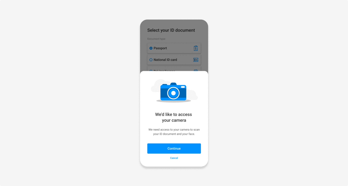
Illustration colors
Input background colors
Themes
You can set light mode and dark mode themes for the UI, and are responsible for adding the theme class and hosting the styles.
Example code:
.dark-theme fl-flow-onboarding {
  /* Add your custom CSS variables for dark theme */
}

.light-theme fl-flow-onboarding {
  /* Add your custom CSS variables for light theme */
}
Updated about 1 year ago
Related pages