
Web UI Customization
Integration Options
This page sets out how to customize the Web SDK UI to match the look and feel of your brand.
Layout
Border radiuses
The border radius sets how round or square corners of elements are.
You must set acceptable border radius values. See Mozilla Developer – border-radius.
Custom properties:
| Property | Description |
|---|---|
--fl-button-border-radius | The border radius for buttons. |
--fl-hint-border-radius | The border radius for user hints displayed to the client. |
--fl-illustration-border-radius | The border radius for illustrations. |
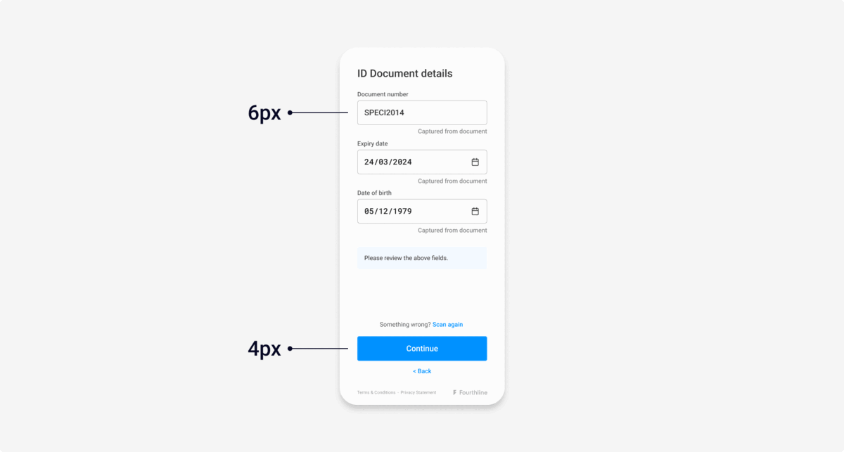
--fl-input-border-radius | The border radius for client input fields. Default: 4px |
--fl-main-border-radius | The border radius for the whole screen. |
--fl-qr-border-radius | The border radius for the redirect QR code. Default: 4px |
Example code:
  --fl-main-border-radius: 4px;
  --fl-button-border-radius: 4px;
  --fl-illustration-border-radius: 4px;
  --fl-hint-border-radius: 4px;
  --fl-qr-border-radius: 4px;
  --fl-input-border-radius: 6px;
Example screens:
Left: Default border radius | Right: Custom
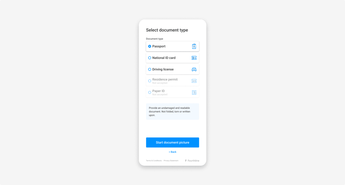
Buttons
Primarybuttons use the--fl-color-primaryas the background color with white text.Secondarybuttons use white as the background color and--fl-color-primaryfor text.- The disabled state sets how buttons and inputs appear when inactive or un-clickable.
Custom properties:
| Property | Description |
|---|---|
--fl-button-border-radius | The border radius for buttons. Default: 4px |
--fl-button-disabled-color | The button text color in disabled state. Default: --fl-button-primary-color |
--fl-button-disabled-background-color | The button background color in disabled state. Default: --fl-button-primary-background-color |
--fl-button-disabled-border-color | The button border color in disabled state. Default: --fl-button-primary-border-color |
--fl-button-disabled-opacity | The button opacity in disabled state. Default: 0.5 |
--fl-button-primary-color | The primary button text color. Default: --fl-color-light |
--fl-button-primary-background-color | The primary button background color. Default: --fl-color-primary |
--fl-button-primary-border-color | The primary button border color. Default: --fl-border-color |
--fl-button-secondary-color | The secondary button text color. Default: --fl-color-primary |
--fl-button-secondary-background-color | The secondary button background color. Default: --fl-color-light |
--fl-button-secondary-border-color | The secondary button border color. Default: --fl-border-color |
Example code:
{...}
  --fl-button-disabled-color: var(--fl-color-primary);
  --fl-button-disabled-background-color: var(--fl-background-color);
  --fl-button-disabled-border-color: var(--fl-color-primary);
  --fl-button-disabled-opacity: 1;
Example screens:
Left: Default button | Right: Ghost button
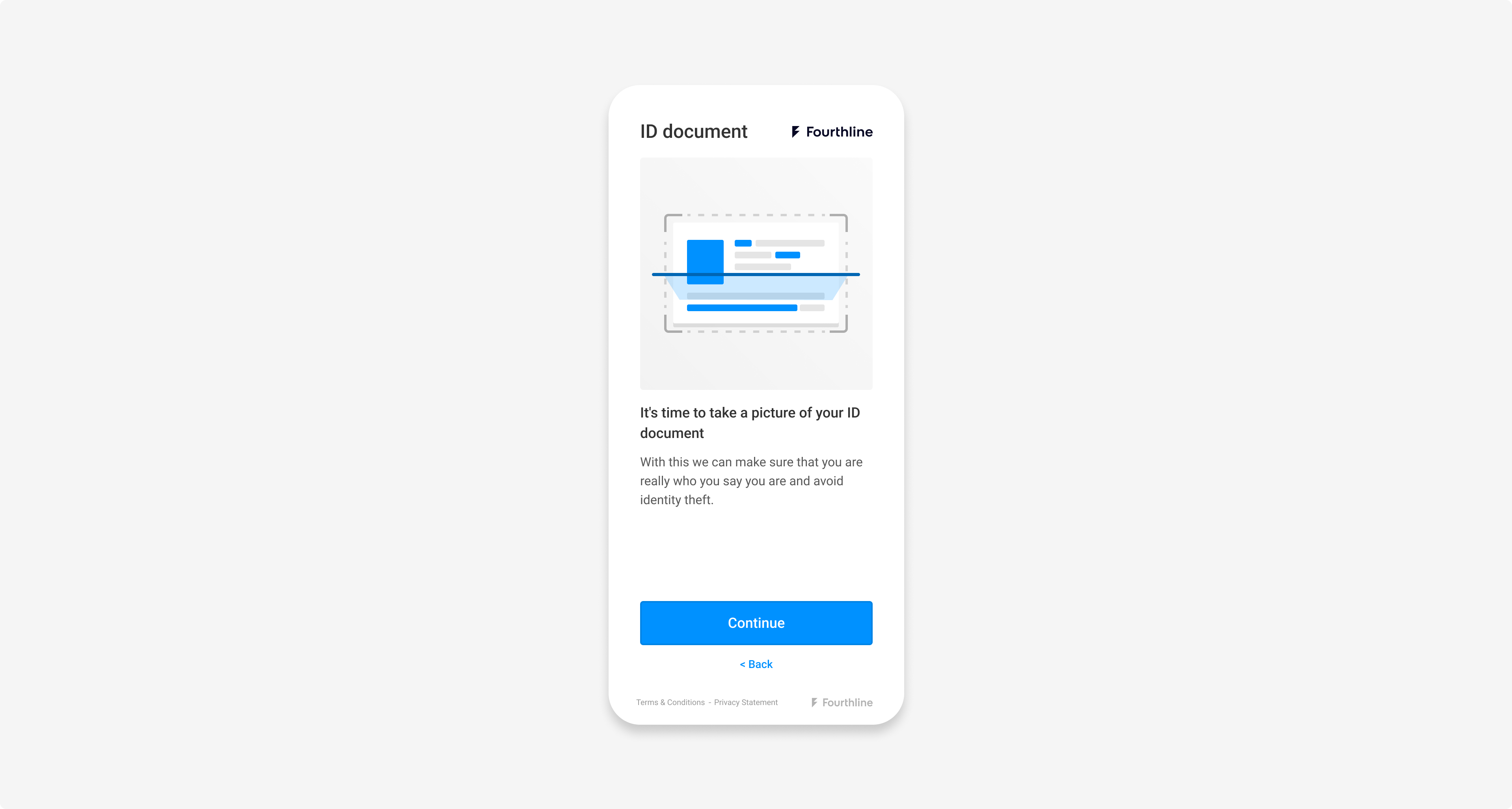
Illustrations
The introduction screen for each flow contains an illustration.
Custom properties:
| Property | Description |
|---|---|
--fl-illustration-color | The illustration color. Default: --fl-color-primary |
--fl-illustration-background-color | The illustration background color. Default: rgba(0, 0, 0, 0.05); |
--fl-illustration-success-color | The illustration success color override. Default: --fl-color-success |
--fl-illustration-border-radius | The border radius of the illustration. Default: 4px |
Example screens:
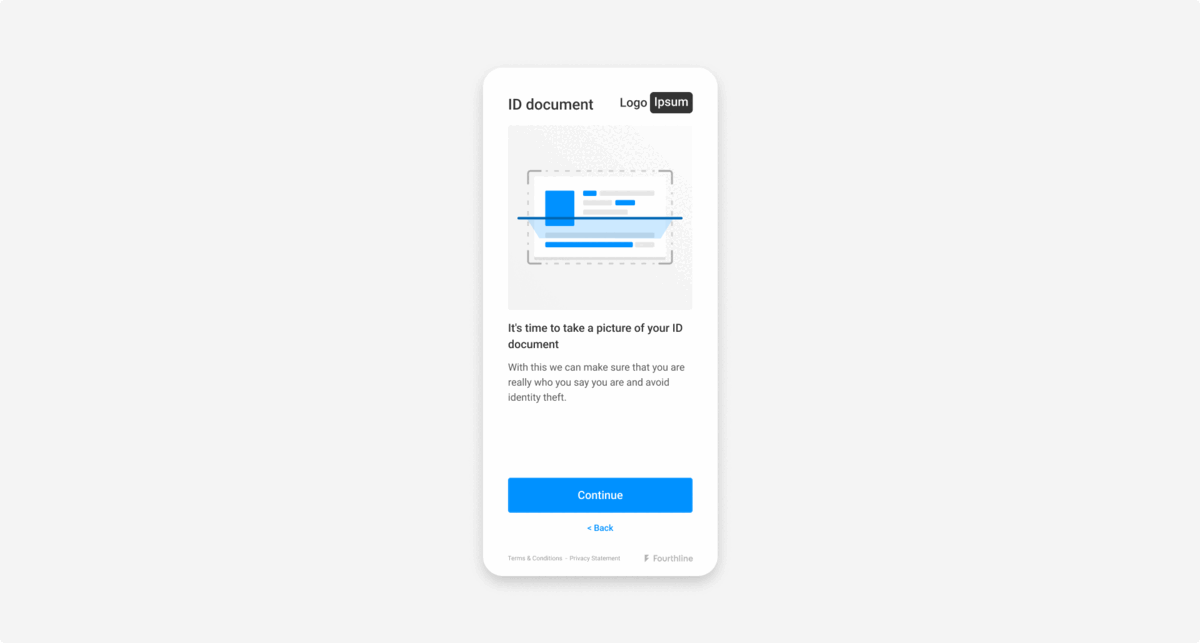
Left: Default illustration | Right: Custom
Inputs
Inputs are fields where the client enters information, e.g. name, address, contact details.
Custom properties:
| Property | Description |
|---|---|
--fl-input-background-color | The input background color. Default: --fl-background-color |
--fl-input-border-color | The input border color. Default: --fl-color-gray |
--fl-input-border-radius | The input border radius. Default: 6px |
--fl-input-color | The input text color. Default: --fl-heading-color |
--fl-input-danger-color | The text color for input danger hints. Default: --fl-color-danger |
--fl-input-disabled-background-color | The background color for disabled inputs. Default: # F2F2F2 |
--fl-input-focus-shadow | The box shadow for focal inputs. Default: 0 0 4px 0 var(--fl-color-info) |
--fl-input-font-weight | The font weight for the input text. Default: --fl-font-weight-bold |
--fl-input-info-color | The text color for input information hints. Default: --fl-color-info |
--fl-input-placeholder-color | The placeholder text color for inputs. Default: --fl-text-light-color |
--fl-input-selected-background-color | The background color for inputs when selected. Default: --fl-input-background-color |
--fl-input-selected-color | The color for inputs when selected. Default: currentColor |
Example code:
{...}
  --fl-input-selected-color: var(--fl-color-light);
  --fl-input-selected-background-color: var(--fl-color-dark);
Example screens:
Left: Default inputs | Right: Custom
Links
Links redirect the client to another screen.
Custom properties:
| Property | Description |
|---|---|
--fl-link-decoration | The text decoration for links. Default: Underline |
--fl-link-font-weight | The font weight for links. Default: --fl-font-weight-regular |
--fl-footer-link-color | The color of the links in the footer. Default: --fl-text-color |
Logos
Fourthline's logo always appears in the footer of every screen.
You can add your logo in the top-right corner of the following screens:
- Introduction screens, e.g. for the Document module, Selfie module, Signature module
- Generic and system permission error screens
- Success screens
Send your logo in .svg format to your Fourthline delivery manager along with the styles file:
- The maximum bounding box size is 120 x 50 px.
- The logo is flexible, as long as it fits within the 120×50 px bounding box.
Fourthline logo
Padding
To set the padding of the main component, use the --fl-main-spacing property.
You must set an acceptable padding value. See Mozilla Developer – padding.
Example code:
{...}
  --fl-main-spacing: 40px 80px 50px;
Updated 14 days ago